📊 Histograms (Grade 10 Notes)
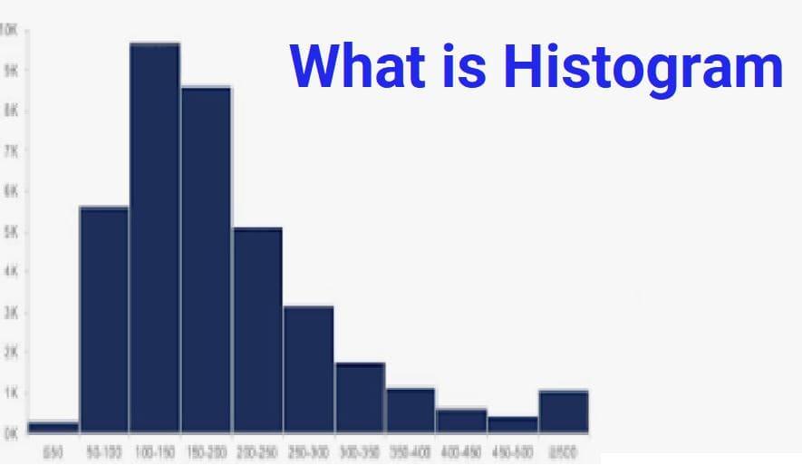
A histogram is a type of graph used to display the distribution of numerical (quantitative) data.
Histograms help us understand how data is spread, where most values lie, and the overall shape of the data.
❓ When Do We Use a Histogram?
Histograms are used when data:
- ✔️ Is numerical (numbers)
- ✔️ Has many values
- ✔️ Is continuous (like height, weight, age, time)
📌 Example Situations
- Heights of students in a school
- Ages of people in a town
- Marks scored in an exam
- Daily temperatures in a city
📋 Example: Ages of 50 People
Suppose we collect the ages of 50 people. Instead of listing all 50 numbers, we group them into intervals called bins.
Step 1 — Create Age Groups (Bins)
- 0–10 years
- 10–20 years
- 20–30 years
- 30–40 years
- 40–50 years
These bins help us organize the data into manageable groups.
Step 2 — Count Frequencies
| Age Group | Number of People (Frequency) |
|---|---|
| 0–10 | 5 |
| 10–20 | 4 |
| 20–30 | 8 |
| 30–40 | 10 |
| 40–50 | 23 |
| Total | 50 |
📈 Drawing a Histogram
Step 1 — Draw Axes
- Horizontal axis (X-axis) → Age groups
- Vertical axis (Y-axis) → Frequencies
Step 2 — Draw Bars
- Draw one bar for each age group
- Height of bar = frequency
- All bars must have equal width
- Bars must touch each other
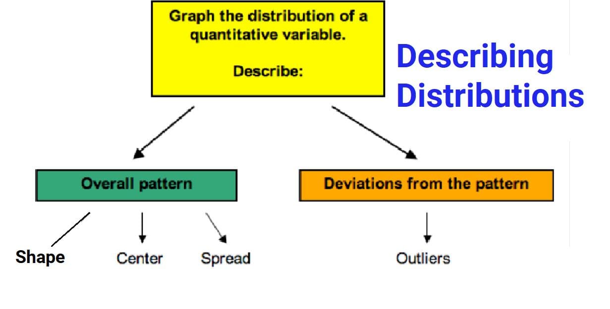
📊 What Does a Histogram Tell Us?
A histogram helps us understand:
- Center: Where most data values lie
- Spread: How much data varies
- Shape: Pattern of distribution
📌 Example Observations
- If bars are tallest in middle → most people are middle-aged
- If bars are spread widely → data varies a lot
- If bars lean to one side → distribution is skewed
⚖️ Choosing Bin Sizes
Bins can be grouped in different ways:
- 0–10, 10–20, 20–30…
- 0–15, 15–30, 30–45…
Usually, 5 to 10 bins give a clear picture of the data.
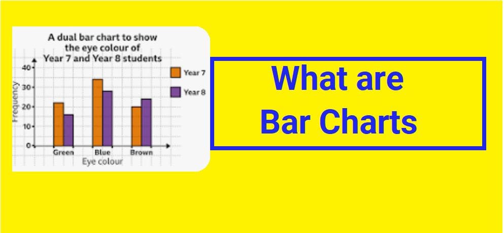
❗ Histogram vs Bar Graph
| Histogram | Bar Graph |
|---|---|
| Used for numerical data | Used for categories |
| Bars touch each other | Bars have gaps |
| Shows distribution | Shows comparisons |
🌊 Kernel Density (Smooth Curve)
A kernel density plot is a smooth curve that shows the shape of the data distribution.
Instead of bars, it draws a smooth line to show where data is concentrated.
📌 Why Use It?
- Shows overall pattern clearly
- Reduces rough edges of histogram
- Better for identifying distribution shape
📌 Simple Idea
If a histogram looks like a mountain made of blocks, a density plot looks like a smooth hill.
🌍 Real-Life Examples
- 🏫 Exam score distribution
- 🏥 Patient age groups in hospitals
- 🌡️ Temperature variations
- ⏱️ Time taken by runners in a race
- 🏠 House price ranges in a city
✅ Advantages of Histograms
- Easy to understand large data sets
- Shows distribution clearly
- Helps identify patterns
- Useful for continuous data
- Supports decision-making
🧠 Key Takeaways
- A histogram shows how numerical data is distributed
- Data is grouped into intervals called bins
- Bars touch because data is continuous
- It helps us understand center, spread, and shape
- Kernel density plots are smoother versions of histograms