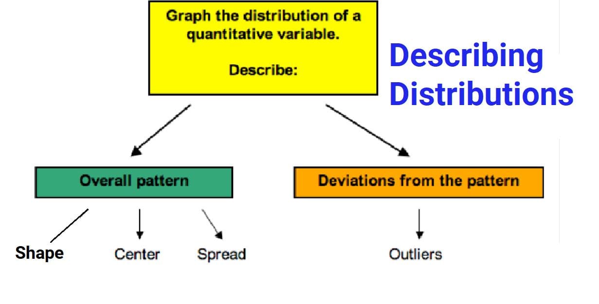
📊 Describing Distributions (Numeric Data)
When we collect numerical data, we want to understand how the values are arranged or spread out.
We can describe a distribution using:
- 📈 Shape
- 📍 Center
- 📏 Spread (Variability)
📈 1️⃣ Shape of a Distribution
The shape tells us the overall pattern of the data.
🔵 A. Symmetric Distribution
A distribution is symmetric if both sides are mirror images around the center.
Common Types:
- Bell-Shaped (Normal Distribution): Most values are near the center, fewer at extremes
- Uniform Distribution: Values are spread evenly across the range
📌 Examples
- Heights of adults
- IQ scores
- Measurement errors
🔵 B. Skewed Distribution
A distribution is skewed if one side is longer or stretched out.
➡️ Right-Skewed (Positively Skewed)
- Tail extends to the right
- Most values are smaller
- Few extremely large values
Examples:
- Income of people
- House prices
- Population of cities
⬅️ Left-Skewed (Negatively Skewed)
- Tail extends to the left
- Most values are higher
- Few extremely small values
Examples:
- Exam scores (easy test)
- Retirement age
🌍 Real-Life Shape Examples
💰 Income Distribution → Right-Skewed
Most people earn moderate incomes, but a few earn extremely high salaries.
📏 Adult Heights → Symmetric
Most adults are near average height, with fewer very short or very tall people.
📝 Class Grades → Left-Skewed
Most students score high marks, but a few score very low.
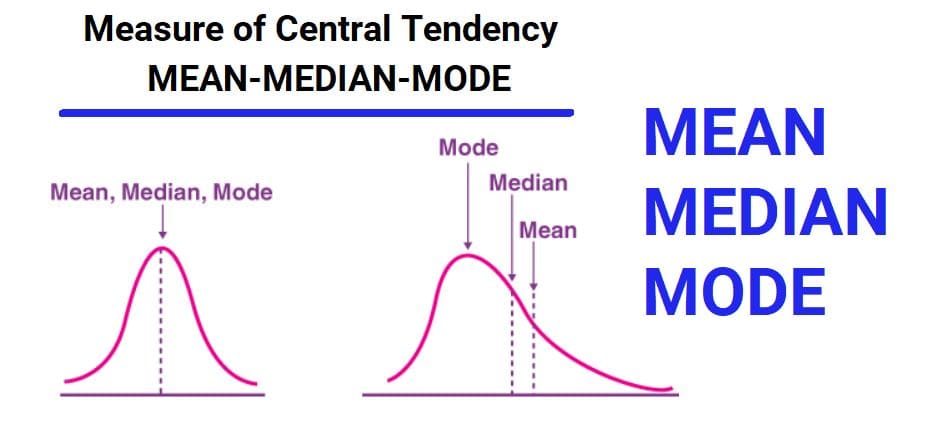
📍 2️⃣ Center of a Distribution
The center is the typical or middle value of the dataset.
Common Measures of Center
- Mean: Arithmetic average
- Median: Middle value when data is ordered
- Mode: Most frequent value
📌 Example
Test scores: 60, 65, 70, 75, 80
- Mean = 70
- Median = 70
- Mode = None
Here, the center is around 70.
📏 3️⃣ Spread (Variability) of a Distribution
The spread shows how much the data values differ from each other.
📐 Small Spread
Values are close together.
Example: 68, 70, 69, 71, 70
📐 Large Spread
Values vary widely.
Example: 40, 55, 70, 85, 100
Common Measures of Spread
- Range: Maximum − Minimum
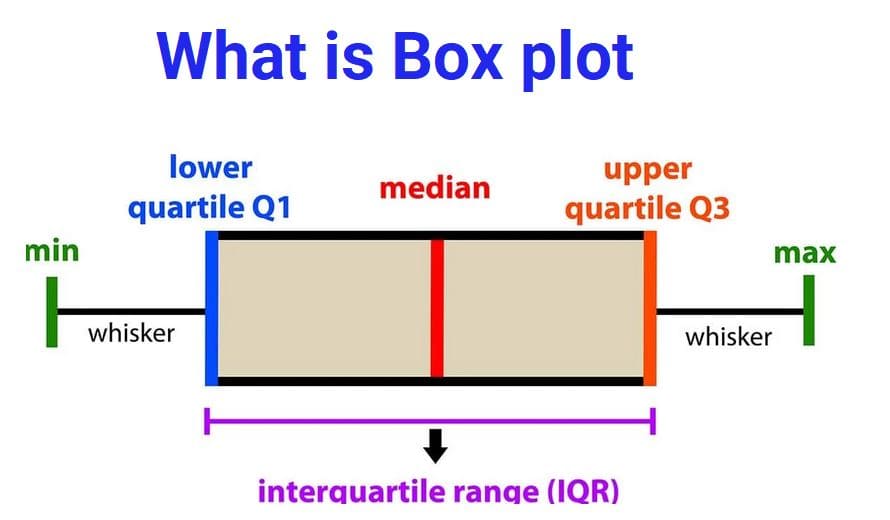
- Interquartile Range (IQR): Spread of middle 50%
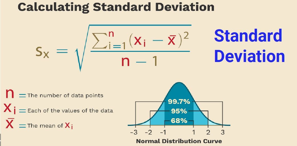
- Variance & Standard Deviation: Measure average deviation from mean
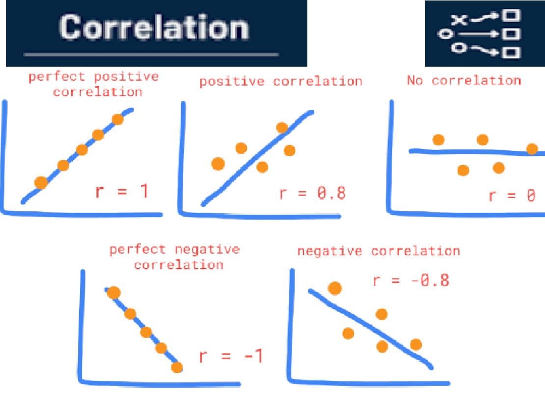
📊 Comparing Distributions
Two distributions may have the same center but different spreads.
📌 Example
Class A Scores: 68, 70, 72, 69, 71
Class B Scores: 40, 60, 70, 85, 100
- Both have similar mean ≈ 70
- Class B has much greater spread
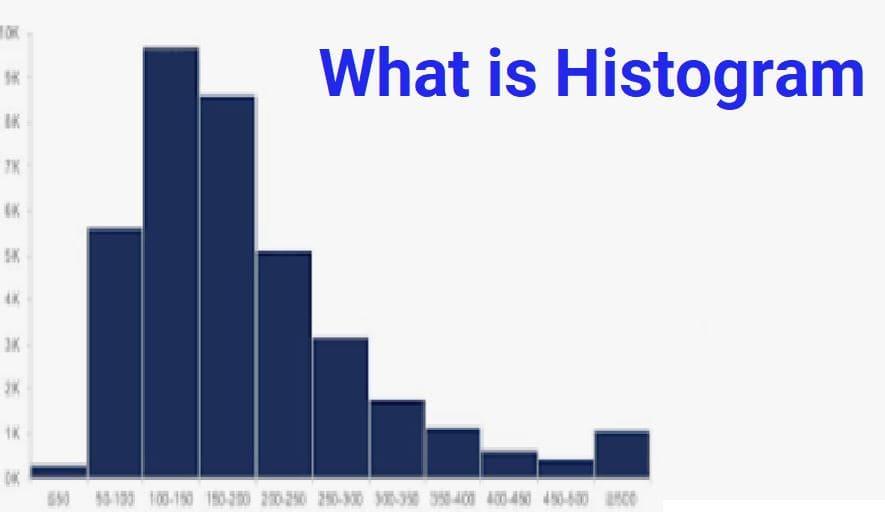
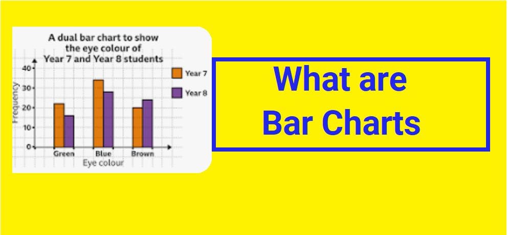
📦 Visual Tools for Describing Distributions
- Histogram: Shows frequency and shape
- Box Plot: Shows center, spread, and outliers
- Density Plot: Smooth curve of distribution
🧠 Key Terms Summary
| Feature | What It Tells Us | Examples |
|---|---|---|
| Shape | Pattern of distribution | Symmetric, Skewed |
| Center | Typical value | Mean, Median |
| Spread | Variability of values | Range, IQR, SD |
✅ Key Takeaways
- Distributions describe how numeric data is arranged
- Shape shows pattern (symmetric or skewed)
- Center shows typical value
- Spread shows variability
- Visual tools help us quickly understand data