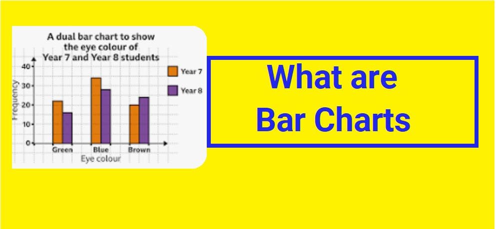
📊 Bar Charts (Bar Graphs)
Organizing data visually helps us understand information more easily. One of the most common and simple visual tools in statistics is the bar chart.
Each bar represents a category, and the height (or length) of the bar shows how much or how often something occurs.
📐 Parts of a Bar Chart
➡️ Horizontal Axis (X-Axis)
The horizontal axis lists the categories being compared. These categories are usually qualitative variables, meaning they are expressed in words rather than numbers.
Examples of X-axis categories:
- Types of sports
- Ice cream flavors
- Car brands
- School subjects
⬆️ Vertical Axis (Y-Axis)
The vertical axis shows numerical values that determine the height of each bar. These numbers represent the frequency.
The taller the bar, the greater the frequency.
⚽ Example 1: Favorite Sports
A bar chart shows that more students play soccer than tennis or basketball.
By simply comparing bar heights, we can quickly identify the most and least popular sports without reading long tables of numbers.
📏 Important Rules When Drawing Bar Charts
- ✅ All bars must have the same width
- ✅ The spacing between bars must be equal
- ✅ Each bar must represent only one category
- ✅ Axes must be clearly labeled
- ✅ A suitable scale must be chosen
Following these rules keeps the chart neat, accurate, and easy to read.
🍨 Example 2: Ice Cream Preferences
Miller is having a birthday party. His mother wants to buy the most popular ice cream flavors, so she surveys 50 guests.
Flavor options:
- Strawberry
- Cotton Candy
- Vanilla
- Mint
- Chocolate
Survey Results:
- 🍫 Chocolate — 18 votes
- 🍦 Vanilla — 10 votes
- 🍓 Strawberry — 8 votes
- 🌿 Mint — 12 votes
- 🍬 Cotton Candy — 2 votes
Miller’s mom organizes this information into a table before drawing the bar chart.
🧮 Steps to Draw the Bar Chart
Step 1 — Draw the Axes
- Draw a horizontal line (X-axis)
- Draw a vertical line (Y-axis)
Step 2 — Label the X-Axis
Write each ice cream flavor as a category.
Step 3 — Label the Y-Axis
Write the number of votes (frequency).
Step 4 — Choose Proper Increments
Miller’s mom uses increments of 2:
2, 4, 6, 8, 10, 12, 14, 16, 18, 20
Choosing increments depends on the highest frequency value.
Step 5 — Draw the Bars
Draw a bar for each flavor up to its vote number.
🎉 Interpreting the Bar Chart
From the completed chart, Miller’s mom can easily see the most popular flavors.
The top three flavors are:
- 🥇 Chocolate
- 🥈 Mint
- 🥉 Vanilla
She decides to buy chocolate, mint, and vanilla ice cream for the party.
✅ Why Bar Charts Are Useful
- They make data easy to understand
- They help compare categories quickly
- They summarize large amounts of information
- They help in decision-making
- They are simple to create and interpret