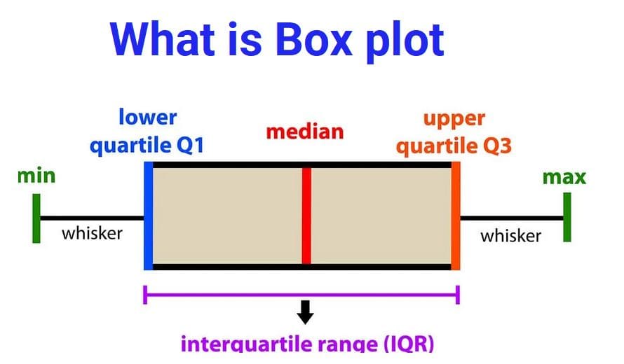
📦 Box Plot (Box-and-Whisker Plot)
A box plot is a graphical tool used to display the distribution of numerical data.
Box plots are especially useful when comparing data sets or identifying extreme values (outliers).
🧮 The Five-Number Summary
A box plot visually represents the five-number summary:
- Minimum — Smallest value (excluding outliers)
- First Quartile (Q1) — 25% of data lies below this value
- Median (Q2) — Middle value of the dataset
- Third Quartile (Q3) — 75% of data lies below this value
- Maximum — Largest value (excluding outliers)
📏 Example: Heights of 50 Students
Suppose we measure the heights of 50 students and summarize the data:
- Minimum = 58 inches
- First Quartile (Q1) = 63 inches
- Median = 66 inches
- Third Quartile (Q3) = 70 inches
- Maximum = 78 inches
These values will be used to draw the box plot.
✏️ Parts of a Box Plot
📦 The Box
The box extends from Q1 to Q3.
📍 The Median Line
A line inside the box shows the median.
- Half the data lies below the median
- Half lies above it
📏 The Whiskers
Lines extending from the box show:
- Minimum value (lower whisker)
- Maximum value (upper whisker)
📐 Interquartile Range (IQR)
The Interquartile Range measures how spread out the middle half of the data is.
Example:
IQR = 70 − 63 = 7 inches
A larger IQR means data is more spread out.
🎯 What Does a Box Plot Tell Us?
Box plots help us understand:
- Center: Where most data lies (median)
- Spread: How much values vary (IQR and whiskers)
- Shape: Whether data is symmetric or skewed
- Outliers: Extreme unusual values
📌 Symmetric Distribution
If the median is in the center of the box and whiskers are equal length, data is balanced.
📌 Skewed Distribution
If one whisker is longer, data is stretched more on one side.
⚠️ Outliers in Box Plots
Outliers are unusual values that are much higher or lower than the rest.
Outliers may occur due to measurement errors or rare events.
📌 Example
If most students are between 60–75 inches tall but one student is 85 inches, that value may be an outlier.
🌍 Real-Life Uses of Box Plots
- 🏫 Comparing test scores of different classes
- 🏥 Studying patient recovery times
- 🏏 Comparing player performances
- 🌡️ Comparing temperatures across cities
- 🏠 Studying house price distributions
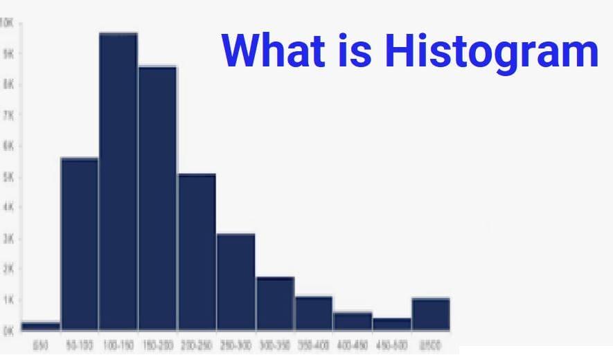
📊 Box Plot vs Histogram
| Box Plot | Histogram |
|---|---|
| Shows summary using five numbers | Shows detailed frequency distribution |
| Best for comparisons | Best for understanding distribution shape |
| Compact and simple | More detailed but larger |
✅ Advantages of Box Plots
- Easy to compare multiple datasets
- Clearly shows median and spread
- Highlights outliers
- Summarizes large data quickly
- Useful for decision-making
🧠 Key Takeaways
- A box plot summarizes numerical data visually
- It uses the five-number summary
- The box shows the middle 50% of data
- The median divides the data in half
- Whiskers show minimum and maximum values
- Outliers appear as separate points