📊 Plots for the Relationship Between Two Variables
In statistics, we often want to know whether two variables are related (associated) and how they are related.
The type of graph we use depends on whether the variables are:
- 📁 Categorical (labels or groups)
- 🔢 Numerical (numbers that can be measured)
🧩 Types of Variable Combinations
There are three common combinations:
- 1️⃣ One Categorical + One Numerical Variable
- 2️⃣ Two Categorical Variables
- 3️⃣ Two Numerical Variables
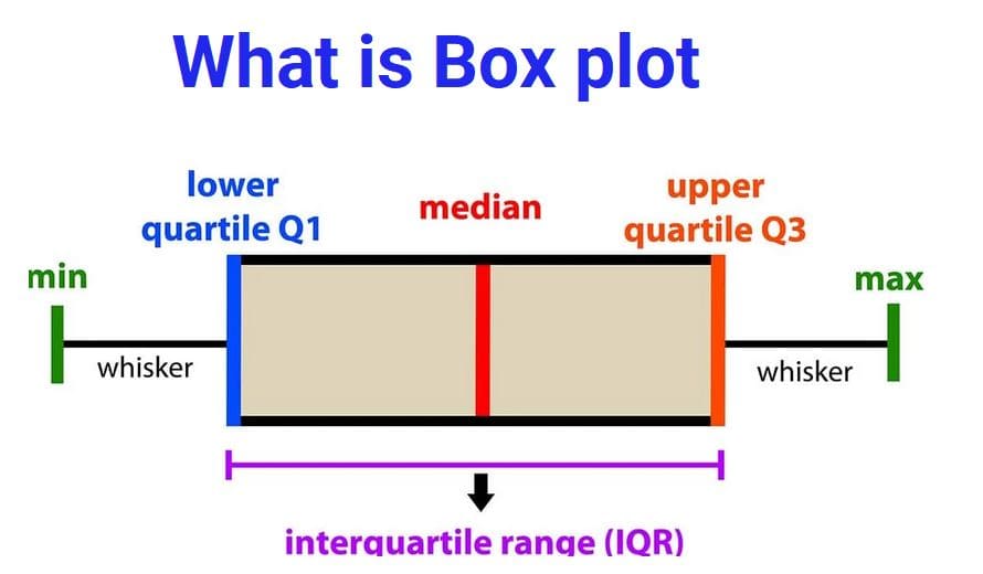
1️⃣ One Categorical and One Numerical Variable
These plots compare the distribution of numerical values across categories.
📌 Example (Association Present)
Variable 1 (Categorical): Skin cancer → Yes / No
Variable 2 (Numerical): Hours spent in the sun per day
If people with skin cancer tend to spend more hours in the sun, their box plot will appear higher than the group without skin cancer.
This visual difference shows an association between the variables.
📌 Example (No Association)
Variable 1: Biological Sex → Male / Female
Variable 2: Body Temperature
Both box plots would look very similar because body temperature does not depend on biological sex.
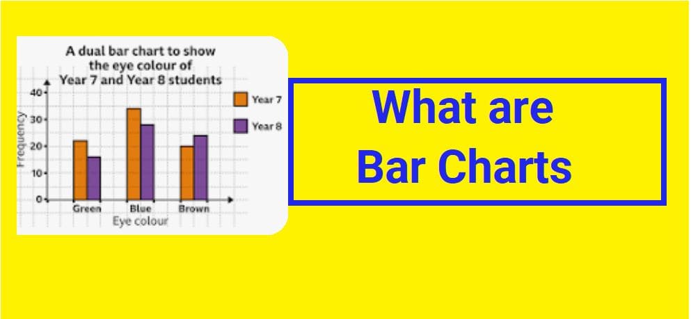
2️⃣ Two Categorical Variables
These plots compare proportions or percentages across categories.
- Side-by-Side Bar Charts
- Stacked Bar Charts
- Mosaic Plots
📊 A. Side-by-Side Bar Chart
Example:
- Variable 1: Smoking → Smoker / Non-smoker
- Variable 2: Lung Cancer → Yes / No
We draw bars showing the percentage of lung cancer cases in smokers and non-smokers.
If smokers have a much higher percentage, the bars will look noticeably different, showing an association.
📊 B. Stacked Bar Chart
Similar to side-by-side bars, but categories are stacked on top of each other to form a full bar representing 100%.
This helps compare proportions within each group.
📊 C. Mosaic Plot (Most Informative)
A mosaic plot is like a stacked bar chart but also shows how large each group is.
- Bar height → percentage within each group
- Bar width → size of each group
📌 No Association in Mosaic Plot
If patterns look similar across categories, the plot forms a cross-like shape, indicating no relationship.
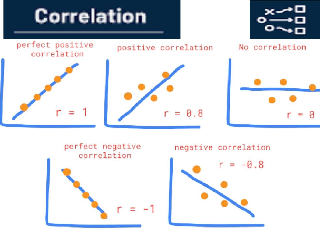
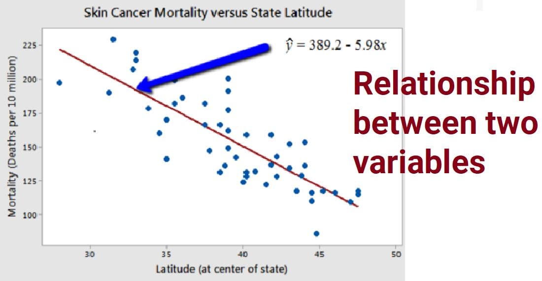
3️⃣ Two Numerical Variables
A scatter plot shows how two numerical variables change together.
- X-axis → First variable
- Y-axis → Second variable
- Each point → One observation
📌 Example (Association Present)
Variable 1: Age of children
Variable 2: Height
As age increases, height also increases. Points form an upward pattern.
📌 Example (No Association)
Variable 1: Age of adults (20–65 years)
Variable 2: Height
Points scatter randomly with no clear pattern because adult height does not depend on age.
🔎 Types of Relationships in Scatter Plots
- Positive Relationship: Both variables increase together
- Negative Relationship: One increases while the other decreases
- No Relationship: No visible pattern
🌍 Real-Life Applications
- 📚 Study time vs Exam scores
- 🏃 Exercise hours vs Calories burned
- 💰 Income level vs Spending habits
- 🌡️ Temperature vs Ice cream sales
- 🚬 Smoking vs Health risks
🧠 Summary Table
| Variable Types | Best Plot | Purpose |
|---|---|---|
| Categorical + Numerical | Side-by-side Box Plot | Compare distributions |
| Categorical + Categorical | Bar Charts / Mosaic Plot | Compare proportions |
| Numerical + Numerical | Scatter Plot | Show correlation/association |
✅ Key Takeaways
- Plots help us visually understand relationships
- The type of plot depends on variable types
- Visual patterns suggest possible associations
- No clear pattern usually means no relationship
- Graphs help before doing detailed calculations