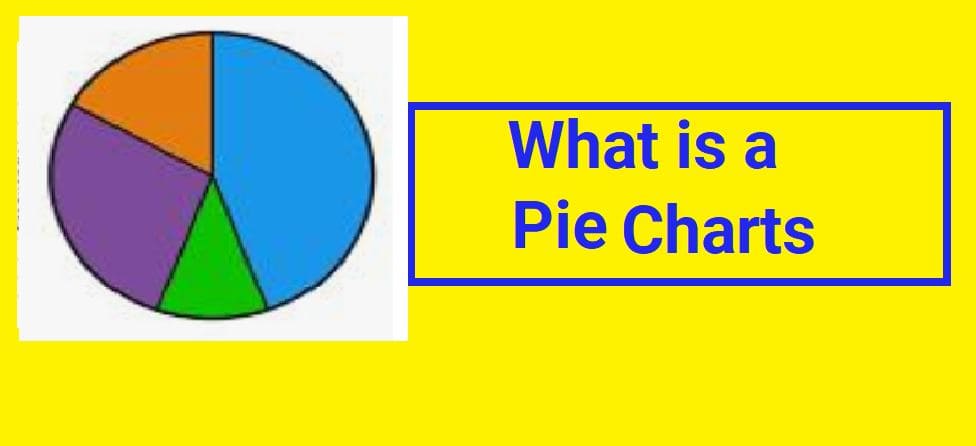
🥧 Pie Charts
A pie chart is a circular graph divided into slices to represent data. It looks similar to a pizza cut into pieces.
Pie charts are useful when we want to show how different categories contribute to a total.
📊 Key Features of Pie Charts
- ✔️ The graph is circular
- ✔️ The entire circle represents 100% of the data
- ✔️ Each slice represents a category
- ✔️ Slice size shows how large that category is compared to the whole
- ✔️ Values are shown as percentages or degrees
🏀 Example: Jacket Sizes for a Basketball Team
A girls’ basketball team is ordering jackets for the Regional Championship. The head coach wants to show the distribution of jacket sizes using a pie chart.
Step 1 — Organize Data into a Table
| Jacket Size | Frequency (Number of Players) |
|---|---|
| Extra Small | 5 |
| Small | 10 |
| Medium | 26 |
| Large | 19 |
Adding the frequencies gives the total number of players:
📐 Step 2 — Convert Frequencies to Degrees
A full circle contains 360 degrees.
To find how many degrees each player represents:
Now multiply 6° by the number of players in each category:
- Extra Small: 6 × 5 = 30°
- Small: 6 × 10 = 60°
- Medium: 6 × 26 = 156°
- Large: 6 × 19 = 114°
✔️ Check the Total
Since the total equals 360°, the calculations are correct.
📊 Step 3 — Convert to Percentages
The entire pie represents 100% of the players.
To find the percentage each player represents:
Now multiply 1.7% by each frequency:
- Extra Small: 1.7 × 5 = 8.5%
- Small: 1.7 × 10 = 17%
- Medium: 1.7 × 26 = 44.2%
- Large: 1.7 × 19 = 32.3%
✏️ Step 4 — Drawing the Pie Chart
- Draw a large circle using a compass or protractor
- Measure each angle from the center using a protractor
- Draw slices based on calculated degrees
Slice Measurements:
- Extra Small → 30°
- Small → 60°
- Medium → 156°
- Large → 114°
Finally, label each slice with its percentage to make the chart easier to read.
✅ Why Pie Charts Are Useful
- They clearly show proportions of a whole
- They are visually simple and attractive
- They help identify the largest and smallest categories
- They are useful for surveys and population data
- They make percentage data easy to understand